Digital Signage
Itaú
Overview
The branch transformation project was created to renovate the physical branches of Banco Itaú. One of the goals was to digitize the elements of the agencies, bringing them closer to digital channels and facilitating integration and renewal with digital platforms. In addition to the architectural redesign and furniture, we work with service design, improving service and new digital elements have been created, such as:
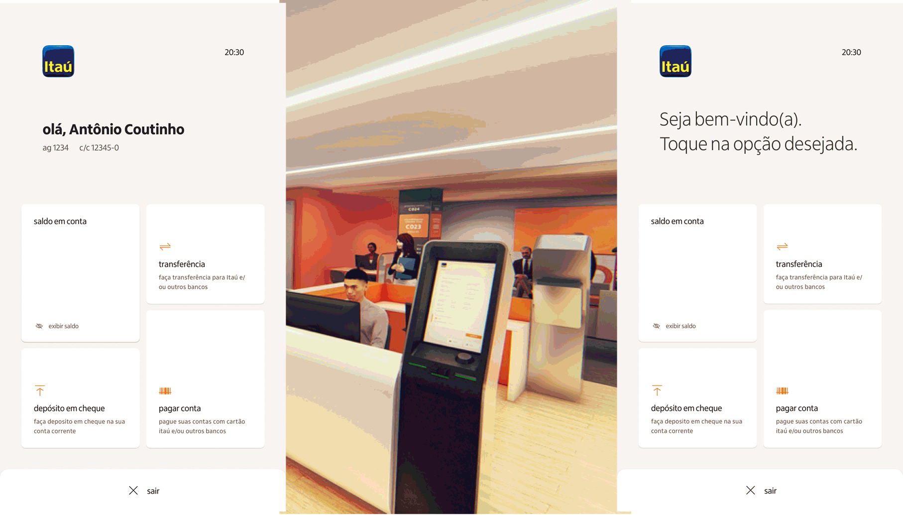
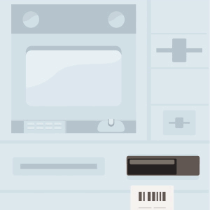
• Inverted cashier – similar to ATMs, inverted cashiers carry out transactions with higher amounts, both in cash and coins, just like the human tellers at the branches. Objective is to encourage self-service and streamline service as a whole
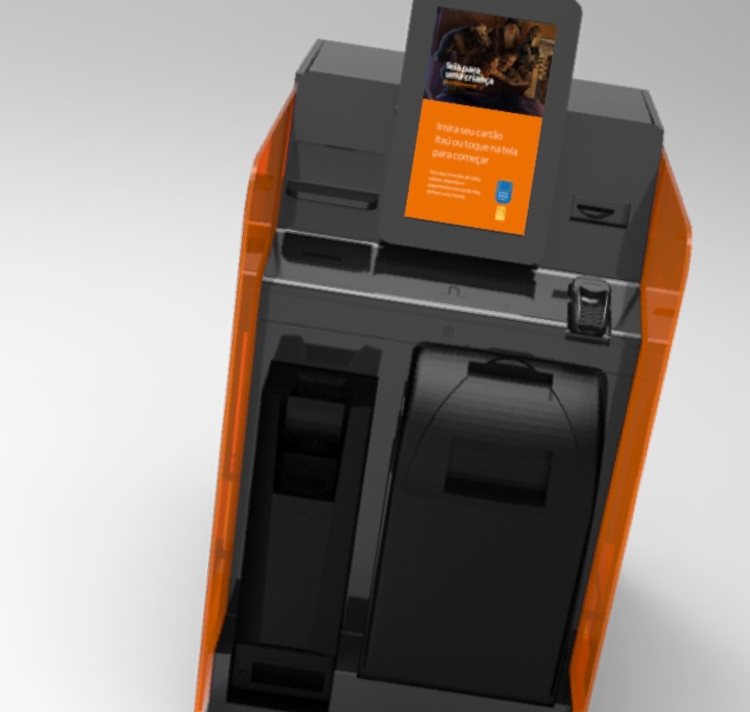
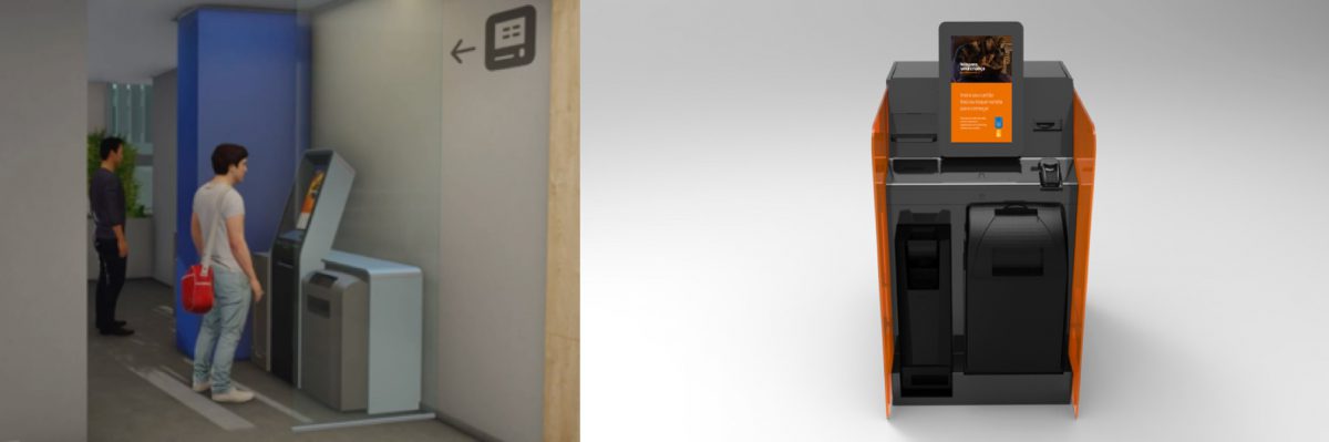
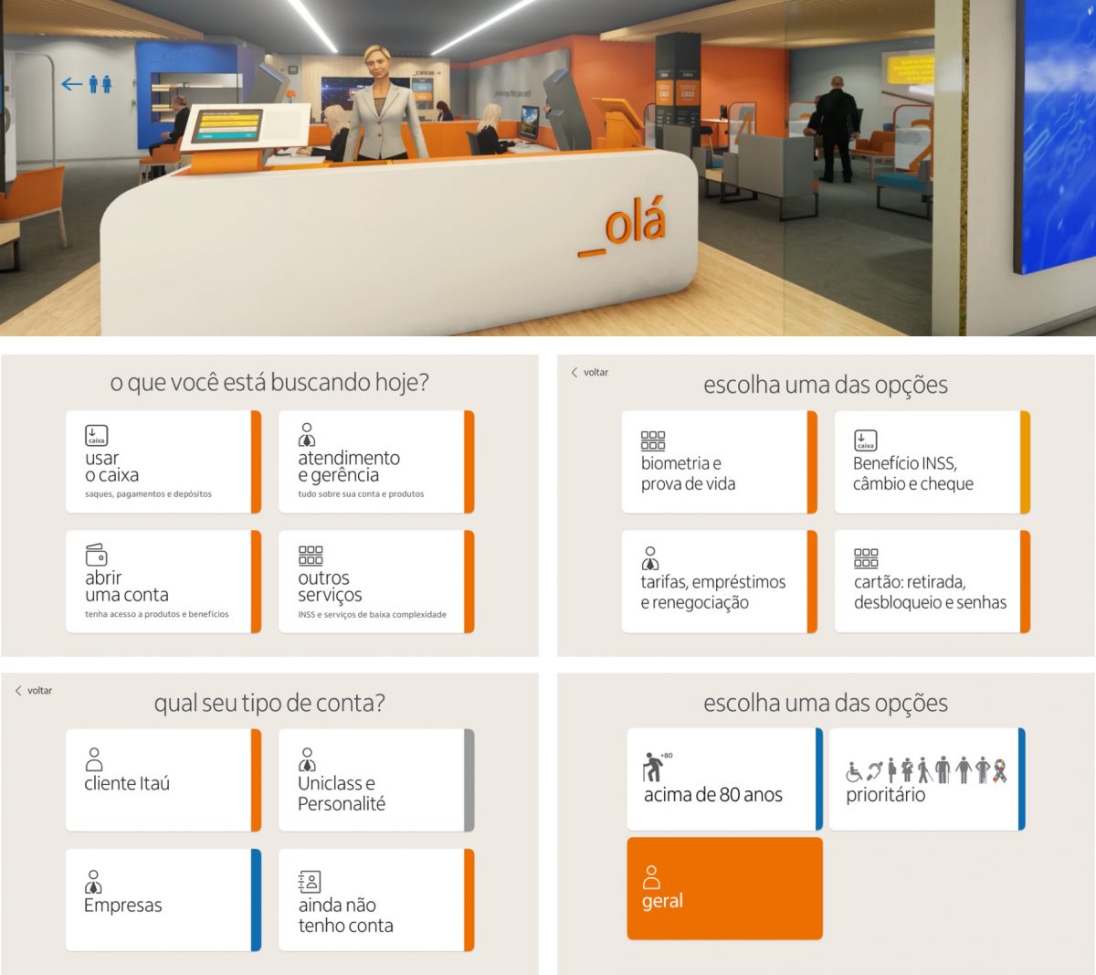
• Totem – new digital element capable of performing all the functionalities of ATMs and APP, less deposit and withdrawals and cash. Objective is to encourage self-service and use of the APP. Encouraging the customer to carry out their transactions without having to attend the agency
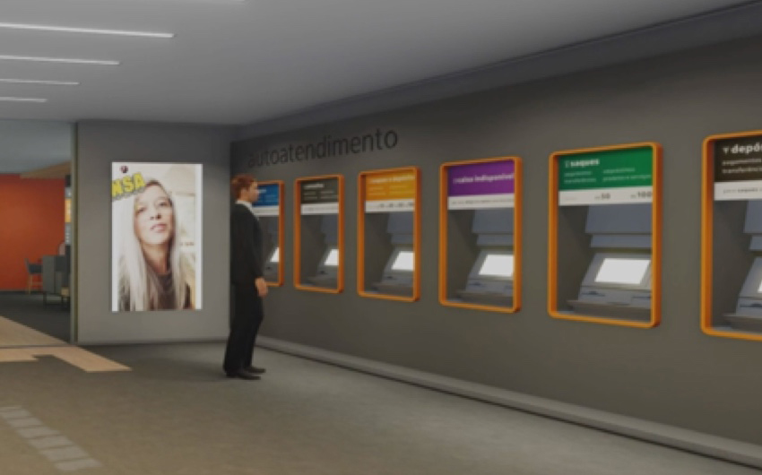
• “Testeiras” – These are screens that are on top of ATMs and transmit information related to the element. Objective is to bring the list of available notes and their functionalities, facilitating the customer experience
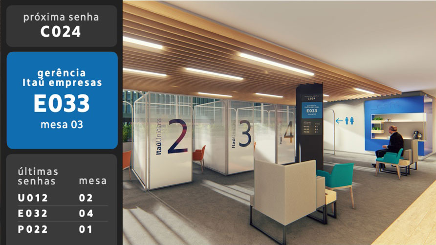
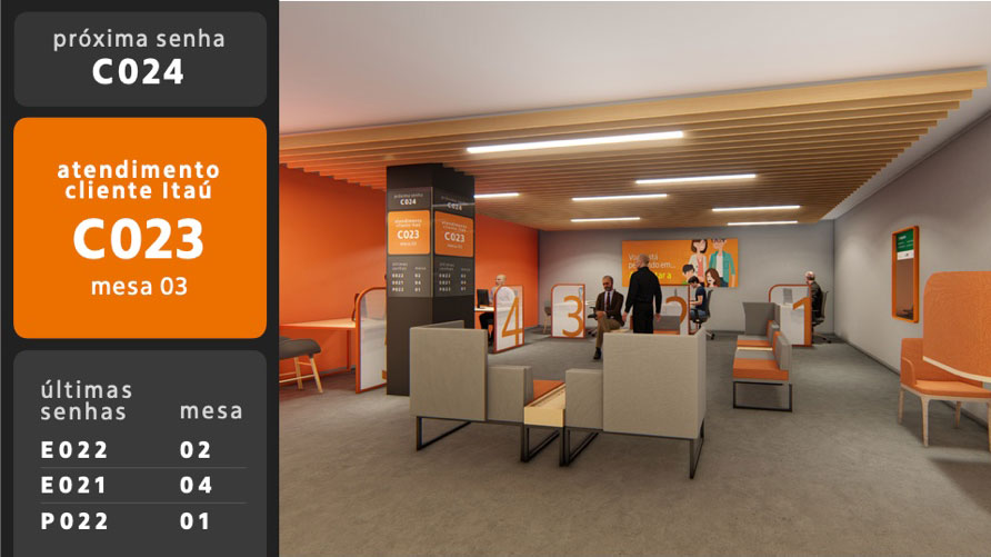
• “Callers” – are the screens that show the passwords at the agency. The objective is to improve the understanding and location of users in the branches, reducing waiting and displacement in human service.
• “Senheiro” – are the totems where customers collect their waiting passwords. Objective is to facilitate understanding, self-service and the location of where the user should get their pending matters done.
Details
Role: Design Specialist/ PO
Client: Itaú
Project: Branch Transfomation/ Digital signage
My role
I was the digital design specialist for the project
Lead a third party team to design and develop the screens
Responsible for ensuring the integration of the teams (automation, industrial design, developers and digital design)
Main tasks
1. Map all the functionality of each element and its improvements
2. Customer research to understand your needs for each element
3. Cross customer objective with business and ensure the best experience
4. Develop all screens, prototypes and tests
5. Test elements in agencies
6. Iterate solutions
Research
• Inverted cashier – was all designed from scratch reusing hardware from other elements. So it became clear that some features had never been used by end users.
• Totem – was the simplest element, people understood well and were very pleased to know that they would have the same interfaces as the APP.
• “Testeiras” – are very controversial elements. People do not read the texts and do not know that each ATM has a feature. Besides the ATM for the disabled are not very clear. The main reason for using ATMs is deposits and withdrawals money and people need to know which notes they can withdraw.
• “Callers” – previously the agencies were divided into several “neighborhoods”, which greatly confused the user. With the redesign it became easier even more so, there was some confusion with an unique callers.
• “Senheiro” – just like the “callers”, the “neighborhoods” were very difficult and the nomenclature “bank text” used on the buttons confused the users.
The Solution
• Inverted cashier, all screens were designed with touch only from the middle of the screen down, ensuring usability for wheelchair users. Self-explanatory steps were created to reduce the learning curve, in addition to the interface being very similar to the APP.
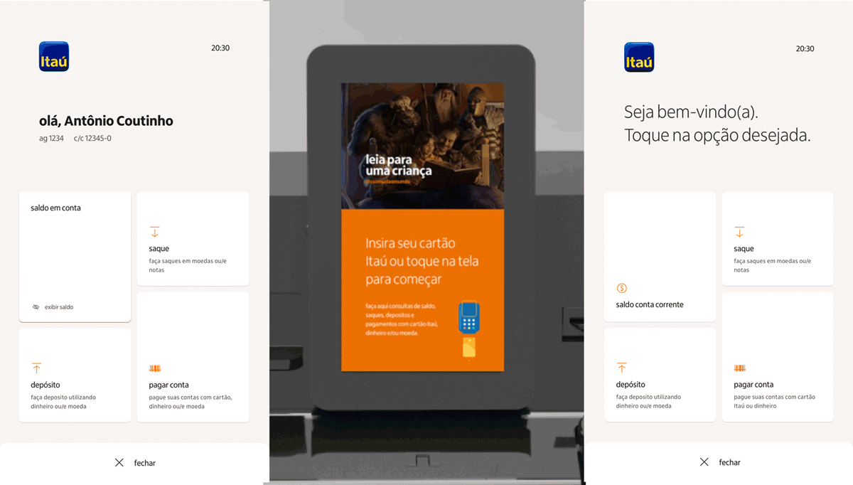
• Totem, also used touch from the middle down and we follow very similar to the APP, facilitating its navigation
• “Testeiras”, in the last survey, after using different colors to differentiate their functionality, it became clear that only the main message and the cash should be highlighted, in addition to the color differentiation only for disabled ATMs. The available ballots are updated in real time, making it easier for the user to choose.
• “Callers”, after using different colors to try to make it easier for users to locate, we only define them to distinguish the disabled and add animation on the screens, drawing the user’s attention, in addition to the audio signal
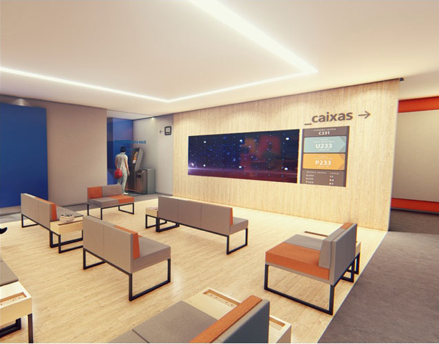
• “Senheiro”, we also follow the same as the callers, with only colors differentiating the disabled and the priority service. We reviewed the entire nomenclature and included a brief description, facilitating the understanding and self-service of customers
Some animation for the ATMs and new elements


Big Numbers
In this project we beat a record within the itáu of development and delivery of a project. It took 7 months between the beginning of research, design and programming of the screens, until the launch of the new agencies
13
Projects
4
New Elements
(inverter cashier, totem, “callers” and recycle ATM)
+900
screens
between 10 flows
+60
new ilustrations and animation supporting the layouts
Awards
Finalista


